Key takeaways
- Decide who the site is for and what they need before choosing colours or fonts.
- Every page needs a clear headline, one main call to action and easy contact details.
- Check the phone layout first, and keep images and plugins light for speed.
- Avoid generic stock photos, vague menu labels, long forms and low-contrast text.
- Pick a platform you can update yourself, or plan for ongoing care.
Start with the visitor, not the design
The best website design tip I can give is to decide who the site is for before anyone picks a colour. A dental patient wants to know if you’re taking new patients and how to book. A tourist wants dates, directions and prices. A researcher wants publications and contact details for the lab.
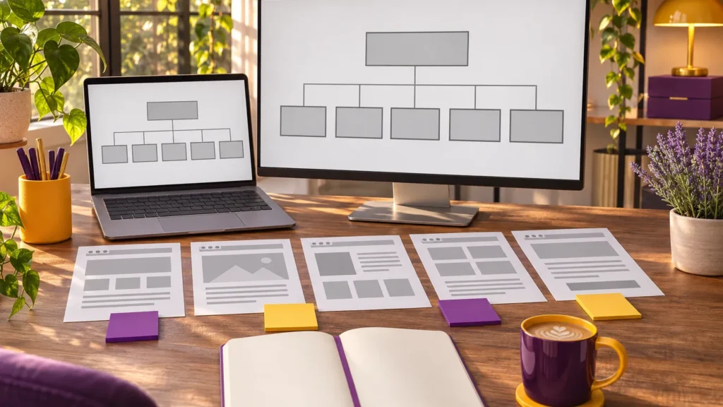
Before I design anything, I ask every client the same three questions: who is visiting, what do they need to find, and what do you want them to do next? The answers shape the menu, the homepage and the calls to action. That’s why the Discover and Plan stages of my process come before Design.
The website design elements every small business needs
Most small business sites share the same core elements. When one is missing, visitors notice.
- A clear headline that says what you do and where, in plain words.
- Simple navigation with five to seven menu items, labelled the way your customers talk.
- One main call to action per page, such as “Book an appointment” or “Request a quote”.
- Contact details everywhere, including a phone number people can tap on a phone.
- Proof: real reviews, real photos, real examples of your work.
- An about page with a face and a name. People buy from people.
A one page website can work for a very small business or an event, but most businesses do better with separate pages for each service, because each page can answer one question well and be found in search on its own.
Design for phones first
For many local businesses, a large share of visitors arrive on a phone. Every site I build is 100% responsive, but responsive isn’t only about shrinking the layout. It means buttons big enough for a thumb, text you can read without zooming, menus that open easily and forms that don’t ask for more than they need.
When I review a design, I look at the phone version first. If the most important thing on the page isn’t visible without scrolling on a phone, the layout needs work.
Keep it fast and light
Slow pages lose visitors. The usual culprits are oversized photos, too many plugins and heavy sliders that load five images when one would do. My web development best practices are simple: size and compress every image, use only the plugins you actually need, and avoid features that look clever but slow the page down.
Speed also matters for search. A quick, well-structured site gives you a better starting point for SEO than a beautiful site that takes forever to load.
What makes a good medical or health website
Health websites carry extra weight because visitors are often anxious or in a hurry. A good medical website is calm, easy to scan and honest. It lists services clearly, explains what a first visit looks like, shows the practitioners and makes booking obvious.
When I designed the site for Sutherland Family Dentistry in Wolfville, the goal was a pretty, unified look built around Dr. Sutherland’s existing logo, with the practical details patients need close at hand. If you run a clinic, my page on medical clinic web design goes deeper.
Common website design mistakes to avoid
These are the website design mistakes I see most often when people come to me for a redesign:
- Stock photos that could belong to any business anywhere.
- Walls of text with no headings, so nobody reads past the first paragraph.
- Clever menu labels that make visitors guess (“Our Journey” instead of “About”).
- Contact forms with ten required fields.
- Pop-ups that appear before the visitor has read a single line.
- Outdated information, like last year’s hours or a staff member who left.
- Low contrast text, such as light grey on white, which is hard for many people to read.
The last one is also an accessibility issue. Good contrast, readable font sizes and descriptive link text help everyone, not just people with a visual impairment.
Use real photos and real words
Nothing makes a small business feel more trustworthy than seeing the actual people, place and work behind it. A few good photos of you, your team, your shop or your finished projects will do more than any stock image. They don’t need to be expensive. Natural light, a tidy background and a steady hand go a long way.
The same goes for writing. Use the words your customers use. If people call you about “roof leaks”, don’t call the page “Residential Envelope Solutions”. Short sentences, clear headings and bullet points make pages easy to scan, which is how most people read online.
Keep colour and type consistent
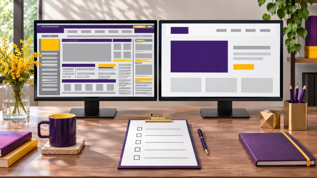
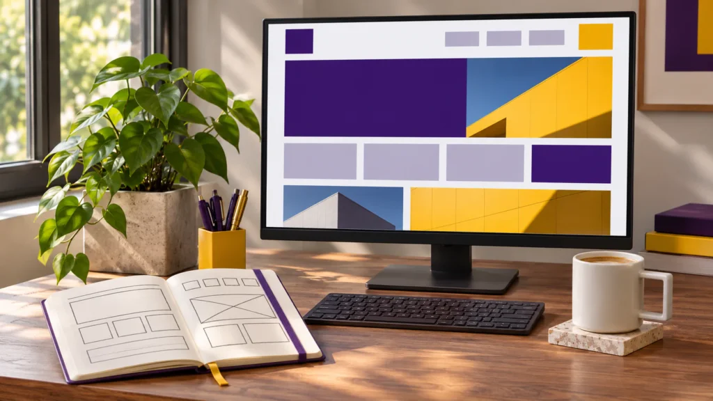
Choose two or three brand colours and one or two fonts, and use them the same way on every page. Headings should look like headings, buttons should look like buttons, and links should be easy to spot. Consistency makes a site feel calm and professional, and it helps visitors understand what they can click without thinking about it. If your colours and fonts aren’t settled yet, start with your brand before the website.
Make it easy to keep up to date
A website is only as good as its last update. I build most sites on WordPress, often with the Divi theme, because clients can edit their own text and photos after a short training session. Every package includes training, from half an hour on the smaller sites to two hours on larger ones.
If you’d rather not touch it at all, that’s fine too. Ongoing website care covers updates and small changes so the site stays current and secure.
When to bring in a designer
You can apply many of these web design best practices yourself. Where a designer earns their fee is in putting them together into one clear, consistent site that fits your brand. If you’re weighing it up, my guides on what a web designer does and how to choose a web designer will help you decide.
Frequently asked questions
What are the most important website design elements?
A clear headline, simple navigation, one main call to action per page, easy-to-find contact details, real proof such as reviews and photos, and a mobile-friendly layout. Everything else builds on those.
Is a one page website enough for a small business?
It can be for a very small business, a single product or an event. Most businesses do better with a page per service, because each page can answer one question and be found in search. See my web design services for package sizes.
What is the biggest website design mistake?
Designing for the business owner instead of the visitor. If a customer can’t tell in a few seconds what you do and how to contact you, the site isn’t doing its job, no matter how good it looks.
Should I use WordPress for my business website?
For most small businesses I recommend WordPress because it’s flexible, widely supported and easy to update yourself. My guide to WordPress website costs covers what to budget.